Progress
Users mainly use digital products to make progress in some area of their lives. Products lacking good Behavior Design often create friction in the way of user progress. Giving the user both the means to progress and making that progress visible to them at all times is critical for seamless digital experiences, especially when the user is caught up in a struggling moment or in hot pursuit of a goal.
Hit!
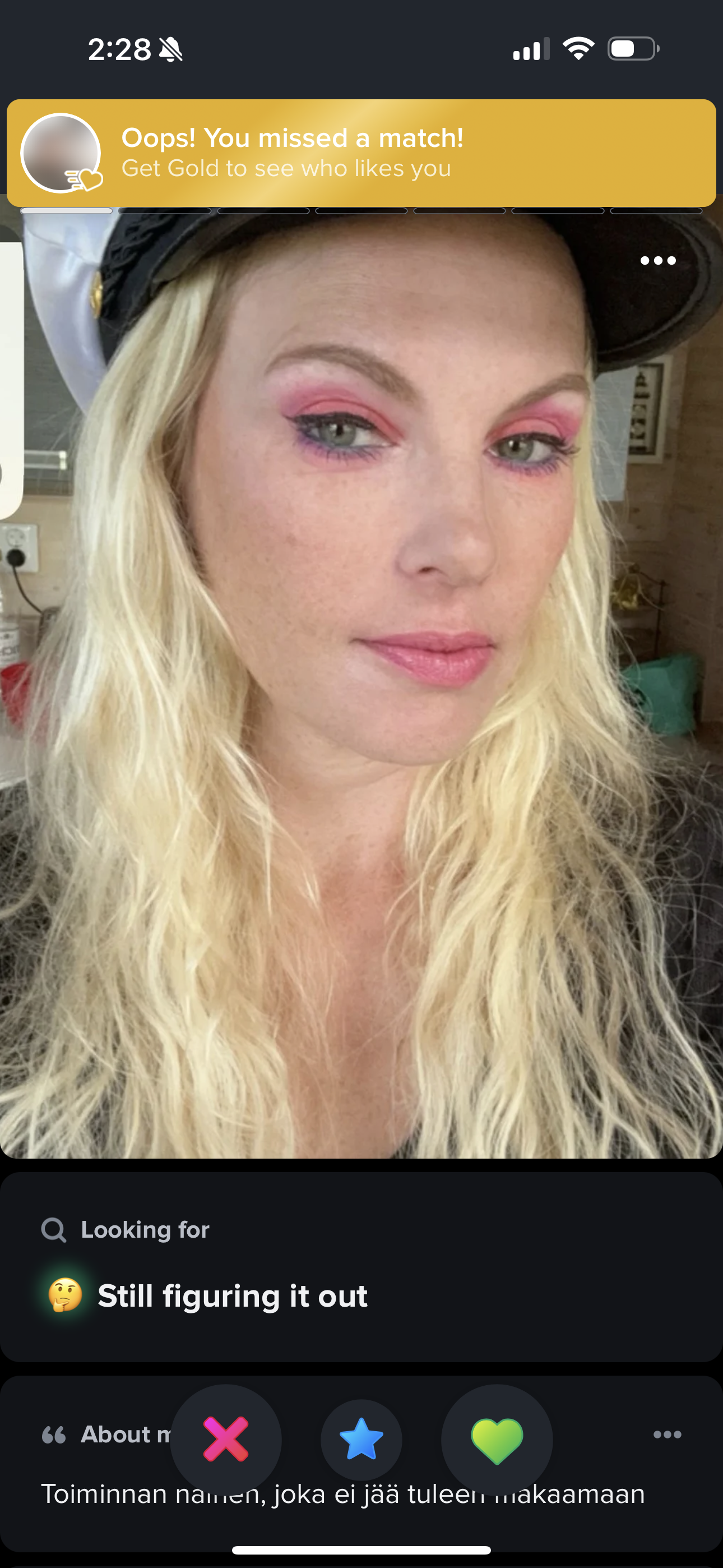
Facebook Dating (02)

Initiating conversations on dating platforms can often be daunting. The subtle "Your Turn" indicator provides a gentle nudge, leveraging the Action Bias to encourage users to take the next step in the conversation. By reducing the ambiguity of whether to continue, this small design element mitigates the ambiguity effect, which can paralyze decision-making. As a result, it plays a crucial role in establishing optimal interaction frequency, a key factor in fostering long-term user engagement.
Principles at work
Action Bias
Miss!
Eventual (01)

This is an incomplete nudge from the disruptive Finnish events startup, Eventual. The number of campaign ‘backers’ required to reach a successful campaign is shown as 2995. However, for that number to be meaningful, potential participants need to see how many people have already backed the campaign. This information indicates the event's popularity and the likelihood of reaching its funding goal in time. For example, needing 2295 more backers out of a million total with one week left is very different from needing 2995 out of 3000 total in the same timeframe.
This nudge suffers from the ambiguity effect, where users avoid options with unclear or incomplete information. To improve this, a progress bar could be added. This leverages the Action Bias by motivating users to act when they see clear steps toward a goal. Additionally, it harnesses the goal gradient effect, where users are more motivated as they perceive themselves closer to completing the campaign. Implementing a clear progress indicator would reduce friction and drive higher participation rates.
Principles at work
Action Bias
Hit!
Prime Video (01)

In on-demand streaming, a significant behavioral shift has emerged: users frequently engage in multiple activities within a single session. Instead of just watching content, they often embark on other discovery journeys, such as exploring actor bios, set details, trivia, and more. Such multi-threaded exploration enriches their overall experience, making it more dynamic and immersive.
Amazon Prime Video's X-Ray feature caters to these new emergent behaviors by leveraging the motivating uncertainty effect. It integrates content from external sources like IMDB directly into the viewing moment, offering additional information such as actor bios, set details, and trivia as an overlay without leaving the video. This deepens user engagement and provides more peaks in the overall experience, fodder for the curious, nerdy side of watching behavior.

Principles at work
Motivating Uncertainty Effect
Hit!
Dropbox (02)

Dropbox now allows users to make comments at specific points in videos, driving growth in two key ways. First, it enables users to create stored value within the product, such as detailed feedback, collaborative notes, and timestamps for important moments. This encourages users to return more, tapping into the tendency of loss aversion, as users are more likely to continue using Dropbox to avoid losing their accumulated value. Second, many comments are intended for sharing, which spreads the product to other users. This nudge aligns with Dropbox's core business of selling annual subscriptions to cloud space. As users can do more with videos in Dropbox, they are likely to upload more videos, which are space-intensive files. This leverages the Sunk Cost Effect, as users who have invested time and effort in uploading and commenting on videos will be more inclined to maintain their subscriptions to avoid wasting their initial investment. These mechanisms together drive powerful inputs into Dropbox’s growth flywheel, encouraging repeat use and expansion.
Principles at work
Hit!
Blinkist (04)

Reading can be mentally absorbing and exhausting. Often, the reward from reading isn't immediate but comes later through knowledge gained or applied. This leads readers to develop a cost-benefit calculation habit, anticipating the value of reading anything complex. Blinkist taps into this tendency by leveraging the Action Bias and the precommitment device. During app onboarding, Blinkist sends a message that helps users assess the future progress they’ll gain from the app by investing effort into it. This nudge brings a future reward into the present, increasing user motivation to start using the app immediately. By encouraging users to commit to their reading goals upfront, Blinkist fosters more engagement and long-term use.
Principles at work
Action Bias
Hit!
Kickstarter (01)

In this example Kickstarter effectively leverages several psychological principles to encourage campaign participation. The campaign prominently displays a visual progress bar indicating how much of the funding goal has been achieved, leveraging the Goal Gradient Effect, which motivates users to contribute as they see the campaign nearing its goal. The precise dollar amounts and remaining days provide transparency and help potential backers gauge the campaign's popularity and urgency. Showing the number of backers helps potential supporters understand the campaign's current support level, reducing ambiguity and guiding decision-making.
The prominent "Back this project" button encourages immediate action, leveraging the Action Bias, which is the tendency for people to favor action over inaction, especially when faced with uncertainty. The clear call to action motivates users to contribute now rather than later. The campaign specifies a deadline, creating a sense of urgency that can push potential backers to act promptly rather than delaying their decision.
The "Remind me" feature serves as a device to motivate interested participants in the future when the campaign reaches a point where it looks likely to close.
The "All or nothing" funding model notes that the project will only be funded if it reaches its goal by a specific date, playing into the loss aversion principle. Potential backers are reassured that their contribution will not be wasted if the goal isn't met. The social links are cleverly placed to allow the viral spread of campaigns peer-to-peer, further increasing the chances of reaching the funding goal. By addressing the ambiguity effect with clear, quantifiable progress, leveraging the Action Bias with a strong call to action, and using the goal gradient effect to motivate through visible progress, this Kickstarter campaign effectively nudges users towards participation and support.
Principles at work
Action Bias
Hit!
Hinge (01)

A great way to show progress is to keep the ultimate user goal front and center at all times. Hinge markets itself as the dating app that is "designed to be deleted," which might seem like a counterintuitive value proposition. While it would be a strange claim from a service like Netflix, where the primary value lies within the app, with dating apps, the key user value is realised outside the app. Users might immediately form an emotional bond with this proposition due to the Noble Edge Effect, which suggests that people feel positively towards companies that appear to act with integrity and altruism. By focusing on this noble goal during onboarding, Hinge effectively leverages this effect, motivating users to progress within the app and complete their profiles. This design strategy not only drives user engagement but also promotes the primary behavior necessary for the app's growth.
Principles at work
Noble Edge Effect
Miss!
Voiceflow (01)

Voiceflow's re-engagement strategy for churned users backfires due to the Interference Effect. By presenting two disparate value propositions simultaneously, the platform confuses users in a critical "beginner's mind" state. This cognitive overload hinders users from focusing on a single path forward. Instead of guiding users towards a clear action, the dual interventions create conflicting mental models of the product, ultimately preventing effective re-engagement and valuable user insight acquisition. A more streamlined approach, such as a simple welcome message or a clear onboarding path, would mitigate these interference effects and improve user experience.
Principles at work
Hit!
Duolingo (04)

Progress is hard to see and measure unless visualised within a bigger picture context. Duolingo does just that in this UI, leveraging the idea of Streaks. Although this visual design can be done better (the flame icon could be smaller, the streak calendar visualised more prominently, the icon could have an aspirational symbolism, etc) the content overall does convey to the user that they are on to the start of something new. This nudge tries to prime the user to invest into a more long-term series of efforts, and go beyond treating the current accomplishment as a standalone one.
Principles at work
Fresh Start Effect
Hit!
Kindle (01)

Kindle leverages the Commitment Bias to foster user engagement through its Streak feature. By visually highlighting and emphasizing the user's ongoing reading streak, Kindle taps into the psychological tendency to remain consistent with past behaviors. The platform's clever use of the prompt "Read before the week is over..." further prompts the core behavior - reading - by creating a clear commitment window. However, the nudge's effectiveness could be amplified by improving this UI’s visual design and adding actionable elements into it. For example: pairing it with a clear call-to-action like "start reading now" or "continue where you left off," Kindle can explicitly encourage users to maintain their reading streak, thereby maximising the impact of the Commitment Bias.
Principles at work
Commitment Bias
Hit!
iOS (03)

Apple exploits functional fixedness to deepen user reliance on its ecosystem. By seamlessly integrating the iPhone into the desktop environment, Apple encourages users to perceive their devices as extensions of one another, rather than as distinct tools with specific functions. This creation of a user mental model, known as functional fixedness, limits their consideration of alternative operating systems. As users become accustomed to this frictionless experience, they are less likely to explore options outside of the Apple ecosystem, thus reinforcing user retention and loyalty to the brand and its device ecosystem.
Principles at work
Functional Fixedness
Miss!
Bumble (02)
In this nudge, Bumble taps into loss aversion, but its effectiveness is diminished by a key issue: the nudge appears after the user has left-swiped on a profile. Since the user has already indicated they’re not interested in that profile, the perceived loss of missing out on the match is minimal, reducing the impact of the nudge.
Principles at work
Loss Aversion
Hit!
GMail (01)


Gmail is experimenting with in-product prompts to influence user behavior. By introducing ‘nudges’ within its interface, Gmail aims to guide users towards specific actions that can potentially enhance their email management efficiency. These prompts may help users to prfioritize tasks, automate routine actions, or discover new features that can assist them in completing their work-related objectives. While the long-term impact of these nudges on user behavior remains to be seen, the underlying strategy is to leverage the platform's visibility to introduce new workflows, user expectations from the category, and differentiation from other email products.
Principles at work
Functional Fixedness
Miss!
Khan Academy (02)

This might seem like a minor issue, but it's actually quite significant and widespread across many products. When users face multiple calls to action, they often experience interference and can't proceed along any single path. In this example, Khan Academy interrupts the user on a crucial page—the donation page—with a request for background information. This distraction hinders the user's progress and could even result in them abandoning their donation journey.
Principles at work
Attention Ratio
Hit!
Kindle (02)

Kindle effectively leverages social proof by highlighting popular passages within its app. By underlining sentences frequently marked by other readers, Kindle creates powerful social cues that guides users towards perceived valuable content. This tactic capitalizes on the psychological principle that people are more likely to adopt behaviors or beliefs when they see others doing so. By tapping into the wisdom of the crowd, Kindle transforms its reading community into a valuable resource, accelerating users' ability to extract key insights and increasing overall satisfaction with the platform.
Principles at work
Miss!
Squarespace (03)
On Squarespace, a nudge (above) reminding users to renew their subscription is placed at the bottom of the screen, making it easy to overlook, especially for users who are focused on managing their sites.
While this placement aligns with Squarespace's minimalistic visual brand identity, the importance of this nudge increases as the payment deadline approaches. Missing a payment is costly for both the user, who loses access to their site, and the company, which suffers from decreased retention.
A more effective approach would be to make the nudge more explicit and prominent as the deadline nears to ensure timely payments. For example, the nudge could be repositioned to the user dashboard (below), where the website is managed—a central location for important and recurring user activities.

Principles at work
Hit!
Duolingo (05)

Duolingo employs the goal gradient effect by utilizing XP as a virtual reward to incentivize users to complete their daily streaks. As users approach the end of a streak, the proximity to their goal becomes increasingly salient, motivating them to exert additional effort. The XP system amplifies this effect by providing a tangible, measurable marker of progress. While effective for those driven by extrinsic rewards, the strategy may be less influential for users primarily motivated by intrinsic factors such as language proficiency.
Principles at work
Sunk Cost Effect
Miss!
GrowthX (01)

At first impression, the call to action (CTA) above titled "Become a member" could be misleading to some target users. It contradicts the platform's primary proposition of "invite-only membership." Users may be confused by the notion that they can simply sign up to join an exclusive community, as suggested by the dialog (below) that appears when the link is clicked. Notice how the focus below is only on the benefits the user would get.

This confusion is only clarified way down on the home page (below), where the steps for joining are explained in detail. This "How do you get in" section also clarifies that the "Become a member" CTA is actually aimed at professionals seeking learning, guidance and placements, rather than at accomplished senior professionals with established careers whose guidance can bring value to the former group.

Experimental variants to test: Provide a visual, easy to grasp overview about the membership process upfront. Change the main CTA to "Apply" or “Start the process” or “Earn an invite” - instead of "Become a member." The terms "apply", “start”, “earn” better reflect the exclusivity and scarcity that are central to the platform's value proposition. They also target the product better, and more accurately represent the process as an application with no guaranteed outcome, rather than an automatic membership.
Principles at work
Hit!
Meta (01)

Notice the subtle framing in the login prompt at the bottom of the screen. Meta positions logging in not as a conditional action without clear purpose, but as the primary way for users to track their progress, presenting a tangible benefit. This small change can significantly impact users who might otherwise be skeptical about logging in, as it now clearly communicates the value and purpose behind the action, making the benefit of engagement more apparent.