Choice
The design of choices - when not done well - can easily confuse users and prevent them from making any choice at all! Good choice design on other hand makes it interesting and easy, and sometimes obvious, for a user to make an optimum choice moving forward in the product experience.
HIT!
YouTube Music (01)

The motivating uncertainty effect works by leveraging the human tendency to be intrigued by the unknown and motivated by curiosity. In YouTube Music's onboarding process, as users select their preferred artists, the platform doesn't immediately show all available options or stick to predefined categories or genres. Instead, it gradually reveals new artists based on the user’s initial choices, creating an element of surprise and anticipation. This uncertainty—about which artists will be presented next—engages users by making the process feel more like a personalized discovery journey rather than a simple selection task. This nudge not only makes the onboarding experience more dynamic but also helps users find quick wins and tangible value right within onboarding, thus reinforcing their positive perception of the product.
Principles at work
HIT!
Soundcloud (01)

SoundCloud here takes a broader approach to onboarding compared to YouTube Music in the above example. This approach particularly resonates with genre enthusiasts, allowing them to quickly delve into their preferred musical style while demonstrating the platform's extensive catalog. Using this dialog, Soundcloud aims to understand the blend of a user's overall musical tastes, while building confidence in users around the platform's breadth of content.
Principles at work
Goal Gradient Effect
MISS!
LinkedIn (01)

LinkedIn's suggested connections often provide limited information for users to make informed decisions. Visual cues like profile pictures and job titles are unreliable indicators of potential connection quality. Many job titles are incomplete, requiring users to visit the full profile for clarity. Mutual connections serve as a weak proxy for connection value, as the nature of the relationship is unclear. Ultimately, the suggested profile's appeal is often reduced to the brand or company affiliation and limited job title information, lacking a clear value proposition or shared interests.
Principles at work
Ambiguity Effect
HIT!
Facebook Marketplace (01)

The small "Nearby" label on product listings is a subtle but effective design element. When considering online purchases, users often weigh the potential value of an item against the inconvenience of acquiring it. For physical goods, proximity plays a significant role in this decision-making process. By highlighting nearby items, this excellent nudge counters the indecisiveness and friction associated with leaving home, encouraging users to take action. This example underscores the importance of framing choices effectively to influence user behavior.
Principles at work
Attentional Bias
HIT!
Khan Academy (01)

Khan Academy's donation dialog effectively leverages both the anchoring bias and precommitment device principles to optimize user giving. By initially anchoring the donation amount at $12, the platform establishes a reference point that influences subsequent donation decisions. This anchoring effect encourages a disproportionate number of users to select the $12 option while also influencing the perceived value of higher donation tiers. Furthermore, by offering both one-time and monthly donation options, Khan Academy implements a Precommitment Device. This allows users to commit to a recurring donation, increasing the likelihood of sustained support and potentially maximizing overall donations. The combination of these psychological principles enhances the effectiveness of the donation dialog.
Principles at work
Anchoring Bias
HIT!
Netflix (01) Vs Apple TV (01)
How can users decide what to watch when they open their streaming app? Netflix and Apple TV tackle this challenge in very different ways, and both have their upsides and downsides aligned with each product’s strategy.
Apple TV (below) prominently features the content users left off in their previous session, automatically suggesting it as 'up next.' Notice the choice of wording here, which does not offer an explicit choice but simply suggests continuing.

By offering fewer choices upfront, Apple TV reduces choice paralysis that comes from being confronted by too many choices. Users can always choose to browse the rest of the collection.
Netflix (below), however, de-prioritizes users' watch history and instead showcases new content in each session. These are likely based around the the user’s profile parameters such as trending shows in the user's region, past watch history, and look-alike algorithmic modeling.

On Netflix, users' watch history appears much lower on the screen, simply as one of many content categories to choose from.

Netflix’s approach emphasis the large content catalog, which can be exciting but also overwhelming. Users might spend a long time searching without finding something to watch. Netflix depends entirely on algorithms to suggest relevant upfront options, but people might often start many shows and finish few.
Apple TVs approach, on the other hand, communicates a curated selection, emphasising quality over quantity. Although this risks communicating that the platform has less content, the choice design helps prioritize a streamlined experience focused on the core reason people use these platforms: to watch something.
Principles at work
Choice Overload Effect
HIT!
Blinkist (02)

Blinkist effectively utilizes a pre-commitment device by presenting users with clearly defined options that outline both investment and potential returns. This approach enables users to set up the right expectations from themselves in terms of what kind of value they will extract from the product over time, while also encouraging commitment to a specific plan. By avoiding a sense of loss associated with any particular choice, Blinkist empowers users to select the option that best aligns with their goals and preferences. This strategy increases the likelihood of user satisfaction and long-term engagement with the platform. However, the only lack in this nudge is that the focus is on the amount of time (the input) and not the number of books read (the output) – the latter being the important factor that users will consider when making this decision.
Principles at work
MISS!
Duolingo (02)

Compare this example with the previous one to see how crucial framing is in setting user expectations and delivering value. While Blinkist above provides quantifiable efforts Vs outcomes, Duolingo uses vague categories like ‘Casual’ and ‘Regular’. The problem with these vague labels is that different users may interpret them differently. For instance, the general idea is there is a huge gap between 'casual' and 'insane' is enormous, and someone putting in an insane amount of work should make an insane amount of progress compared to someone who does the same thing casually. But in Duolingo’s case, that difference is 15 minutes a day and actually can have no much greater impact on learning outcomes. This discrepancy can disrupt the perceived effort-to-reward ratio, making it hard for users to assess the app's value, which can lead to decreased trust and loyalty.
Principles at work
Framing Effect
HIT!
Aha (01)

Aha effectively uses the Anchoring Bias by keeping its pricing model simple. The anchor price is on the left, making the annual plan on the right appear to be a great deal by comparison.
Principles at work
Anchoring Bias

MISS!
Soundcloud (02)
In contrast to Aha, SoundCloud does a poor job of upselling its Pro membership. The reason for the upsell is unclear, there's no comparison with the user's current plan, and no tangible way to understand what 'saving big' means. While SoundCloud mentions access to DAWs, VSTs, and sample packs as benefits of upgrading, these features seem targeted to DJs, making this dialog irrelevant for some users. Instead, SoundCloud should focus on learning about the user's intent around DJing or interest in these products, or target the message only to users who have shown explicit or behavioral interest in DJing. For other users, this dialog is an interruption and misses the opportunity to propose a relevant and valid reason for upgrading. Although the 'Learn More' button helps slightly, the entire dialog could be improved to better retain potential upsell customers.
Principles at work
Ambiguity Effect
HIT!
Hootsuite

This nudge captures user attention with a large spread featuring emotionally engaging photos. Its conversational tone draws readers in, while personalised copy highlighting positive attributes makes the message resonate. The offer concludes with a compelling value proposition based on loss aversion and a ticking timer adding urgency. Overall, it's quite effective. The double-length free trial is very clever; users perceive generosity, but it benefits Hootsuite because the longer duration might allow users to create habits and create more stored value in the form of content or teams on the platforms, making it more likely to retain them therefater.
Principles at work
Loss Aversion
MISS!
Foodora (01)

The suggestion of ‘725 restaurants’ near the user is impressive but doesn't help them narrow down their choices or make a good ordering decision. Essentially, this messaging screen is redundant, forcing users to rely on search to find what they want. This repetitive need to start from scratch each time often leads repeat users to reorder from their history. While this is a useful short-term solution, it hinders the discovery of new restaurants and limits new restaurant partners from reaching potential customers.
Principles at work
Choice Overload Effect
Miss! Vs. Hit!
Highradius Vs. Gem

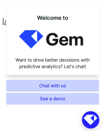
A study of these two bots reveals the sales funnel structure of each company. The the Highradius bot on the left indicates a messy and chaotic customer sales experience, while the Gem bot on the right suggests a smooth and clear one.
The Highradius bot on the left fails to clarify and facilitate user choice. It mixes product value propositions, event invitations, and poorly done customer testimonials, but omits a crucial conversion element: the product demo. Calls-to-action like ‘Let’s connect,’ ‘Looking for resources,’ and ‘I’m just browsing’ are ambiguous and don't provide the company with detailed data on user intent. The bot is cluttered with photographs that neither convince nor communicate effectively, and there's redundancy in the text (‘Let’s connect’ is used twice). This results in poor choice design and low-quality data collection, diminishing the overall effectiveness of the bot. Not to mention the super long headline that has multiple messages blended in, and is well, hard to finish.
In contrast, the Gem bot clearly defines the key options for the user, providing meaningful data regardless of which option is chosen. This minimalistic approach to choice design allows the user to process fewer options and make clearer decision on how they would like to proceed.

Miss!
Oura Ring (02)

In a previous nudge analysis, I examined how Oura’s churned user experience sets a low standard for establishing user trust. Now, let’s explore Oura’s uses choice design on its marketing website downplays its total cost of ownership.
Consider the product comparison charts for the Apple Watch and the Oura Ring (above). Apple provides a clear breakdown of key features for each model. In contrast, Oura directs the user’s attention towards comparing the styles of its models, while the crucial details of the membership costs are tucked away in a tiny dropdown menu. This information is so minimally presented that most buyers—focused on selecting a style—likely don’t invest the cognitive effort needed to consider the implications of the subscription. Moreover, Oura’s messaging leads with “the first month is on us,” creating positive feelings and a sense of reciprocity in the user. This further distracts from the fact that while the first month costs only €5.99, the annual membership is nearly €70, a recurring cost that continues for as long as the user owns the ring.
When a user clicks open the dropdown: notice ( below) how the copy ‘members also get..’ make it sound like the primary value is in the three kinds of scores. While in reality, just three scores are quite meaningless without the explanatory details. Meanwhile, the entire product promise combining sleep monitoring, heart health, women’s health, stress and other areas are entirely inaccessible with just the three scores.

While this clever choice design may help Oura initially conceal a significant cost during checkout, users are likely to be unhappy when they eventually realize the true impact—something I’ve addressed in this nudge analysis.
How to test the subscription model
What Oura’s comparison chart should really do is compare the features of the ring with and without a subscription, and add styling as a design feature among them. This would give customers a clear picture of what they their money is worth, and Oura would find out whether customer preferences are oriented towards the ring’s features - or its styling.
Principles at work
Hit! Vs. Miss!
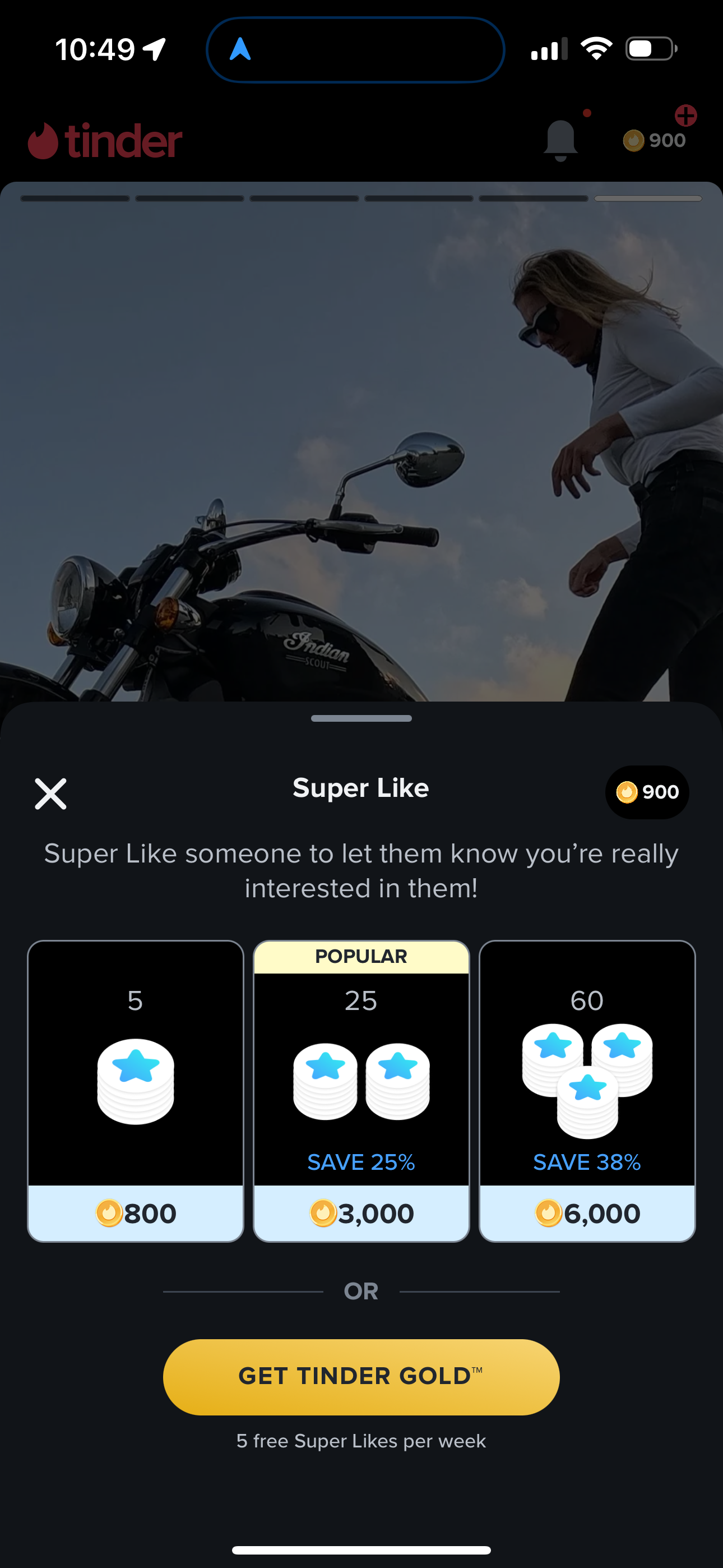
Bumble (03) Vs. Tinder (02)

Bumble, on the left, presents a straightforward offer designed to increase super swipe usage. This approach can create a positive feedback loop, assuming super swipes enhance match potential. By sending a super swipe, a user can stand out to a potential match. Additionally, the time-bound nature of this offer allows Bumble to strategically introduce it during peak user activity. The underlying logic of this nudge is that using super swipes will lead to more matches, ultimately driving super swipe purchases.
In contrast, Tinder, on the right, introduces a more complex choice matrix by implementing a token or currency system for super likes. This system creates an upfront cost for using super swipes, potentially discouraging immediate use. Unlike Bumble's focus on reducing time to value, Tinder's strategy presents a barrier to super swipe adoption.
Principles at work
Attention Ratio